
Introduction
There are more mobile users than desktop users nowadays in this digital world, creating great transformation as to how we do the building and designing of websites. A mobile-first approach is not a trend anymore; it requires adherence. Development of WordPress themes while considering usability in mobile devices from the ground up enables your site to be not only great-looking at every device but also performance-efficient. Since more than 50 percent of traffic to the web is from mobile devices, optimization for such features increases accessibility, search engine ranks, and total user experience. A mobile WordPress theme must provide all screen sizes, fast loading, and good navigation for users needing e-mobility.
Developing a responsive WordPress theme demands a deeper knowledge of HTML, CSS, PHP, JavaScript, and how the WordPress template hierarchy fits into the design. Most developers build the theme on a desktop and then scale down to smaller devices. However, in a truly mobile-centric theme-the last is first: it builds for the very smallest screen first and progressively enhances the experience. This article’s guide is on how to create a mobile-first WordPress theme, from planning a layout and a framework to developing styles that will be responsive, optimize media, and test that across devices. So if you build the theme from scratch or improve an already existing theme, thinking with mobile users at the beginning will produce a far better final product.
Planning Your Theme with a Mobile-First Mindset
Understanding the Needs of Mobile Users
Mobile users differ from desktop users in that their approach is typically more task-oriented and time-sensitive, so content and functions must be as easily accessible as possible with the minimal effort. Mobile design is not so much about adapting the content as it is about simply making it easier for the user to surf through the most essential features in a format that is right for smaller screens and touch interfaces. Consider your audiences before you even begin coding your theme: Are they viewing blog posts? Shopping? Filling out forms? Browsing through galleries? What functions are most important to them on mobile?
The mobile-first mentality focuses on simplicity and functional conciseness. Key components must be easily accessed, such as large buttons, straightforward menus, and readable typefaces. This entails rigorous wireframing, where each visual and functional element can justify its own existence. A user-centered mentality maintains that the layout of the theme should coincide with real-world mobile behavior. Just remember, there is a great variance in resolution, screen size, and performance capabilities of mobile devices—what works on one phone may not work so well on another. That is why flexible layouts, scalable media, and performance optimization are paramount for the success of your theme.
Choosing Frameworks and Tools That Support Responsive Design
If the development of a mobile-first WordPress theme has to be simplified, it would be wise to have a responsive framework and design tool in hand that truly cater to the mobile user experience. CSS frameworks like Bootstrap, Tailwind CSS, and Foundation make a perfect base in quickly developing a responsive layout. By using predesigned components and a responsive grid system, developers will spend more of their valuable time working on design and functionality, rather than rebuilding the layout system from scratch. When combined with a well-thought custom theme, these frameworks have demonstrated workflow enhancement and the mitigation of bugs relating to device compatibility.
Design applications such as Figma and Adobe XD allow designers to prototype layouts that start from the smallest mobile screens and go to the larger breakpoints. One can check touch elements even before the developer codes them. For the WordPress developer, the starter themes that offer a good file structure such as _s or Sage are already super clean, mobile-ready, and best practices, compliant with WordPress. These themes will allow customization and expansion to fulfill the intent of their designs and usability goals. Development can also benefit from the use of CSS preprocessors, including SASS, and various build systems such as Gulp or Webpack; this helps improve the optimization of assets, their modularization, and performance on mobile devices.
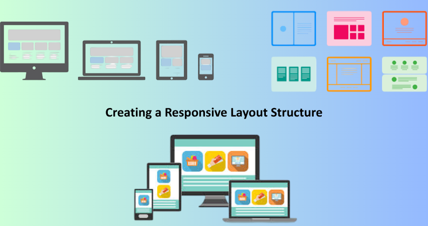
Creating a Responsive Layout Structure
Building a Mobile-First Grid System
Having a responsive layout has a flexible grid system as its starting point. In mobile-first layout development, the grid is defined from the small screen upwards and then enhanced using media queries for the larger viewport. This ensures that the content shows well on mobile before any desktop enhancements are applied. Building this sort of structure requires CSS Flexbox and Grid: Flexbox is very good for one-dimensional layouts, such as horizontal navbars or stacking cards, while Grid excels at two-dimensional layouts such as complex content sections.
When you’re creating your own grid, define all styles for mobile in your CSS first, adding media queries for tablets and desktops as necessary. Use relative units like percentages, em, or rem rather than fixed pixel widths to ensure fluidity across different screens. Minimum column counts should be kept on mobile, usually one column works best, and more columns added with increased screen width. Absolute positioning should not be used unless necessary, and one should rely on min-width media queries so that the components grow with the screen instead of beaching with the port side. This whole concept is just so wonderfully unambiguous and scalable, suits well everywhere.
Implementing Responsive Navigation and Menus
Mobile navigation is one of the trickiest components when it comes to responsive design. Menus should be easily accessible but not take up much space. The common answer for this is the hamburger menu, which shows a hidden navigation panel on toggle. To be sure whether the consumers are candid enough to make comments concerning site usability and accessibility. All tappings possible for menu items, visible focus states seen by keyboard users and screen reader users.
Other than being customizable for styling and manipulation by JavaScript as well as CSS, the output which is generated by WordPress’s function wp_nav_menu() presents great flexibility with regard to navigation. Mobile-first themes tend to use JS to toggle classes to show or hide menus, always providing a graceful degradation for users that have disabled JS. Consider off-canvas navigation or sticky headers for improved usability. Testing the menu on real devices, particularly older or less powerful devices, is crucial to avoid sluggishness and rendering problems. And always make usability trustworthy by applying ARIA proper attributes concerning accessibility and keyboard navigation support. A responsive menu system greatly enhances mobile UX and feeds into overall site engagement.
Optimizing Visual Elements for Mobile Devices
Handling Responsive Images and Media Queries
Having images on a mobile site can either enhance or ruin the experience. Large images that have not been optimized are the major contributors to slow mobile site performance, which translates to high bounce rates and poor search engine rankings. Images supported via the srcset attribute are automatically built into WordPress for image resizing so the browser can render the image that corresponds to the user’s screen resolution. When developers specify sizes attributes, it helps even more, as the browser is directed on how the image will be shown, taking away a lot of the guesswork and consequently gaining more performance.
The code in your theme can call for wp_get_attachment_image() or the_post_thumbnail() with the right registered image sizes using the add_image_size() function along with the lazy-loading mechanism –delay loading of images until they are needed through the loading=”lazy” parameter tagging on the images. Make your videos and iframes responsive by placing them in a container and apply relative positioning tricks along with padding to maintain aspect ratios. Use media queries to adapt image sizes, aspect ratios, and visibility according to screen width. Hiding non-essential graphics on smaller displays in favor of other content optimized for mobile maintains a tight and efficient user experience.
Typography, Buttons, and Touch-Friendly UI Elements
For mobile devices, typography must not be zoomed and should be readable while buttons should be finger friendly instead of mouse-friendly. Scale your font size responsively using either rem or em so that it obeys user-accessibility decisions. A good rule of thumb is to consider a base font size of 16px, maintaining suitable line height (1.5-1.8) for readability. Equally important is contrast: the text must stand out from the backgrounds, while consideration of text color must be taken for good contrast under direct sunlight or on poor-res screens.
Touch optimization requires a height of at least 44px for buttons and enough space between them to avoid accidental presses. Implement a secondary interaction by hover effects since there is no guarantee of their working on mobile devices. The hover effects will provide visual feedback concerning active/focus states. The icons should be intuitive for the user and placed consistently. The same form should accept the input types such as tel, email, or number. All these obvious elements will inspire-to build, of course- an inspirational-but-simple mobile interface designing.
Enhancing Performance and User Experience

Mobile Performance Optimization Techniques
A fast-loading website is essential to mobile users, many of whom may be on slow connections. Start with lean coding practices by removing unnecessary scripts, styles, and plug-ins. Use auditing tools such as PageSpeed Insights or GTmetrix, and resolve any detected performance bottlenecks. CSS and JavaScript should be minified; any non-critical scripts should be deferred to allow rendering. WordPress has some plugins that make the above process easier, including WP Rocket and Autoptimize.
Implement caching at the server and browser level, and employ a CDN to serve assets from closer geographical locations. Conform your theme to Core Web Vitals, which measure loading (Largest Contentful Paint), interactivity (First Input Delay), and stability (Cumulative Layout Shift). All of these factors directly affect search rankings and user satisfaction; render-blocking resources on your theme will further affect the page-rendering time, especially when the visitor is on a mobile device. Optimizing the theme so that the backend and all the way through the frontend provide a seamless experience on the mobile.
Testing Responsiveness Across Devices and Browsers
Being exquisite does not guarantee success if a design remains untested on various devices and browsers. The responsive process necessitates real-world testing for content, images, and interactivity to ascertain their functionality across different screen real estates. With various tools such as Chrome DevTools, BrowserStack, and Responsively App, developers have been granted an unparalleled opportunity to simulate any number of device viewports. Nonetheless, hands-on testing using real devices-witness especially low-end Android – often unveils performance issues that emulators fail to highlight.
Your testing checklist should include all matters of functionality, layout, legibility, and performance. Ensure the working of forms, menus remain accessible, and nothing is clipped or wholly off-screen. Test across various operating systems, browsers, and resolutions, such as Safari, Chrome, and Firefox. Also test for orientation differences on the device: portrait and landscape. Use the accessibility tools for keyboard navigation, focus indicator, and screen reader support checks. Performing a thorough and consistent session with different tests ensures improved user experience and saves further troubleshooting for an issue, which otherwise can harm your brand value or even turn off retention.
Conclusion
The process of developing a WordPress theme with mobile in mind is no one-size-fits-all solution. Rather, this is a strategic endeavor that begins with understanding how users behave, and that ends with continuous optimization and testing. It should be this way, whether choosing right frameworks and planning for layouts, or the responsive styles with touchers. Each decision taken in the course of development has to emphasize usability on mobile terms, especially in the present age of mobile internet usage, which demands that developers not only develop themes excellent in appearance on smaller screens but also great in performance, delivering fast, intuitive, and accessible experiences.
So much as the mobile web is changing, that is how you also change your approach to developing themes. Think Flexibility-cum-Continuous improvement. Keep up with mobile UX trends, test all the time, and always come back to thinking of and for the users in all design processes. You will be not only meeting today’s mobile criteria, but you would also future-proof your themes against the ever-changing landscape of web space. Truly, a mobile-first WordPress theme isn’t a mere technical achievement, but really means a commitment to a much better user experience as well as modern best practices in the industry.