Building a website is not all about beauty; it is also about furnishing directions to the visitors for actions that really matter. Be it the purchase of a product, filling out forms, or remaining on your site for long, good navigation makes a big difference. In this article, we will look at ways to design navigational frameworks on websites that convert. Let’s break it into key elements and discuss them one after another.
Understand Your User’s Journey
Before any design considerations, it’s important to take time to consider your user. Walking inside his or her shoes for a moment provides you with a perfect understanding of how your visitor will walk through your site. Doing so will help create a logical path that feels spontaneous and blissfully free from obstacles. Eradicating these frictions will make every step feel almost like second nature.
Map User Intent before Designing Navigation
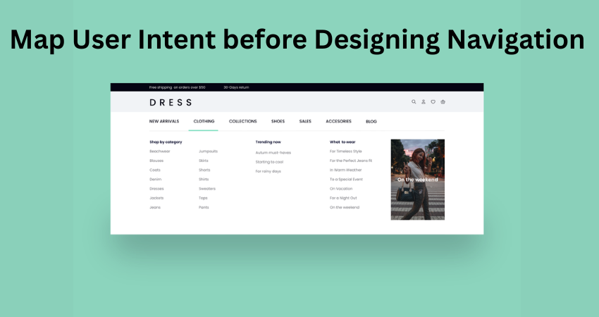
I understood what your users actually need. Are they looking for information about the services you provide? Or do they want to get in touch really fast? Perhaps they’d like to read your blog, or may also be searching for prices. When you map out all these different intents, you can actually construct navigation pathways for the intended purpose of each one. Use hotmap-and-session recordings tools, like those from Hotjar or Microsoft Clarity, to create an understanding of click behavior. It is all about placing the user where he is-before he gets lost.
Keep Navigation Simple and Predictable
Clean, predictable navigation reduces confusion and improves user experience. People shouldn’t have to guess where a menu item will take them. A well-organized menu provides clarity and builds trust.
Avoid Overcrowded Menus
Visitors can be simply overwhelmed by too many choices. Limit the essentials to maybe 5 to 7 main menu items. If you have more content, use dropdowns or mega menus that allow categorization of the conflicting links. Think of it as a restaurant menu: you want to give a selection of choices but don’t want to make it difficult for the customer to decide. Give priority to your most important links: “Services,” “About,” and “Contact”—and pricing in particular.
Use Descriptive Labels for Links
If you could kindly let me offer my input on an interesting case: we think right-labeling is more important than most people would consider. Clear, descriptive link text indicates to a user where they will be sent when clicking. This leads to confident navigation.
Avoid Generic Terms Like “Stuff” or “Things”
Do not use generic terms like “Products” or “Stuff We Do”; use specific terms like “Web Design Services” or “SEO Packages.” Descriptive words enhance transparency, which will encourage potential customers to act on your offer when they can foresee its outcome. Your navigation should be in your prospective customers’ language, which makes them feel recognized—and will thus raise conversion attention.
Highlight Key Conversion Pages
Not all pages are created equal. Rather, the navigation should gently influence users toward those pages that lead to results: a contact form, pricing info, or a demo request.
Use Visual Cues to Emphasize Important Links
These important links can stand out by contrasting colors and weights or by using buttons. For example, if “Get a Quote” is your most important call to action, it should be styled to stand out in the header. It has an easy-going visual weight that nudges users toward your conversion goals. A conveniently placed menu CTA link can really help nudge your conversion rate upward.
Make It Mobile-Friendly
As of now, more than half of all web traffic occurs on mobile devices, which means that navigation must be equally functional as with desktop devices. Users of mobile devices would rather have it simple and quick.
Implement a Clear Mobile Menu Design
As with menu that can be collapsed on a mobile devise, it should encourage people to think of counterpart for the desktop version as well. Make sure that a mobile menu contains similar primes as the desktop version but in collapsible format that is easy to tap. Size buttons such as thumbs can push them down easily, and hold links in the same general categories. Try it out on as many devices and screen sizes as possible to satisfy smooth operation no matter where one browses.
Incorporate User Feedback
It is your users that are the best source of insights about what works—and what doesn’t. Regularly collecting feedback helps you optimize navigation for even better results.
Use Surveys and Analytics to Refine Navigation
Set up a brief survey, feedback form, or post-chat poll to gather user comments on their navigation experience. Augment this with Google Analytics data (especially “Behavior Flow” and “Exit Pages”) to start identifying trouble spots. Should multiple users be dropping from a certain page or bouncing back quickly, this is prime real estate for some menu structure modifications. Simple changes based on real feedback can create significant gains in user experience and conversions.
Test and Optimize Continuously
Navigation cannot be considered a set-and-forget tool, for the best-performing sites are constantly modifying and restructuring their sites on the basis of user behavior and performance data.
A/B Test Different Navigation Structures
In a similar vein, you could test various menu layouts, link orders, or button styles: Does “Contact Us” convert better in the main navbar or as a floating button? Compare performance using Google Optimize or Optimizely; A/B testing removes the guesswork from design decisions and allows real data to drive conversions.
Conclusion
It is not to fill in the menu with so many links as in creating website navigation that converts but in purposeful sensing directing your user. Trust, friction, and a little push for action-all these are built with clear, uncomplicated, and intuitive navigation. Such understanding and mapping of one’s audience’s intent in his path and journey would mean that every click becomes a step closer to conversion.
From descriptive labels and visual cues to the emphasis in key pages and optimized for mobile; every decision is with an eye toward user experience. For one, don’t forget feedback and testing new ideas. Finally, always optimize since navigation is a never-ending strategy that adapts to new businesses and users. The heart of all things is empathy. Think as your users think. Make things easy for them. And remember: a well-designed navigation menu does not serve humans as a place where they can find information from, but where they find value out of.